
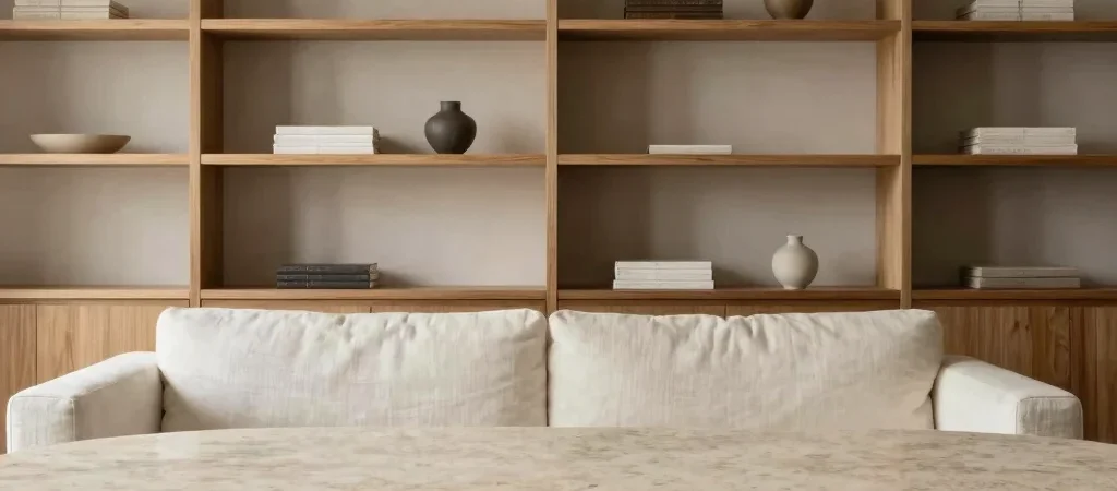
Monochromatic design often risks feeling cold or incomplete when reliant solely on flat paint finishes. True architectural minimalism relies on tonal restraint coupled with high-contrast tactile variance. When color contrast is dialed back, the subtle grain of stone, warmth of timber, and weave of textiles assume center stage.
Layering Tonal Neutrals for Subtle Visual Warmth
Soft linen, warm alabaster, and pale parchment form a cohesive canvas that feels lived-in rather than clinical. Moving away from stark bright whites allows natural sunlight to filter across surfaces with a gentle radiance. Layering slightly varied warm tones across upholstery, rugs, and walls creates depth without visual friction.
Introducing Raw Travertine and Unpolished Stone
Unpolished stone surfaces ground monochromatic rooms with raw earthy weight. A low travertine coffee table displaying natural voids and veining introduces organic sculpture to clean-lined seating arrangements. The matte finish absorbs light, offering a calm counterpoint to smooth plastered surfaces.
Striking Spatial Balance with Warm Wood Accents
Integrating subtle warm timber accents prevents tone-on-tone palettes from flattening out. Low oak joinery, floating walnut shelving, or timber ceiling beams frame viewports and anchor seating groups. These natural wood elements reinforce the connection between interior spaces and surrounding natural environments.